


Anatomy of a cover
Techniques for making DIY book covers

I’m not a designer, but in some ways I thought that might make this more useful to other indie authors - especially if you’re just starting out and don’t have massive budgets to splash on covers.
Following from last week’s exploration of titles, covers and blurbs, I thought it’d be fun to dive a little deeper into how the covers for my books were created.
I’ll go in reverse order, starting with my current project.
Tales from the Triverse
Triverse is a genre mash-up of fantasy, science fiction and crime fiction. It’s about a group of detectives in 1970s London tasked with handling portal-related criminal activity. It’s a lot of fun.
Here’s the cover:
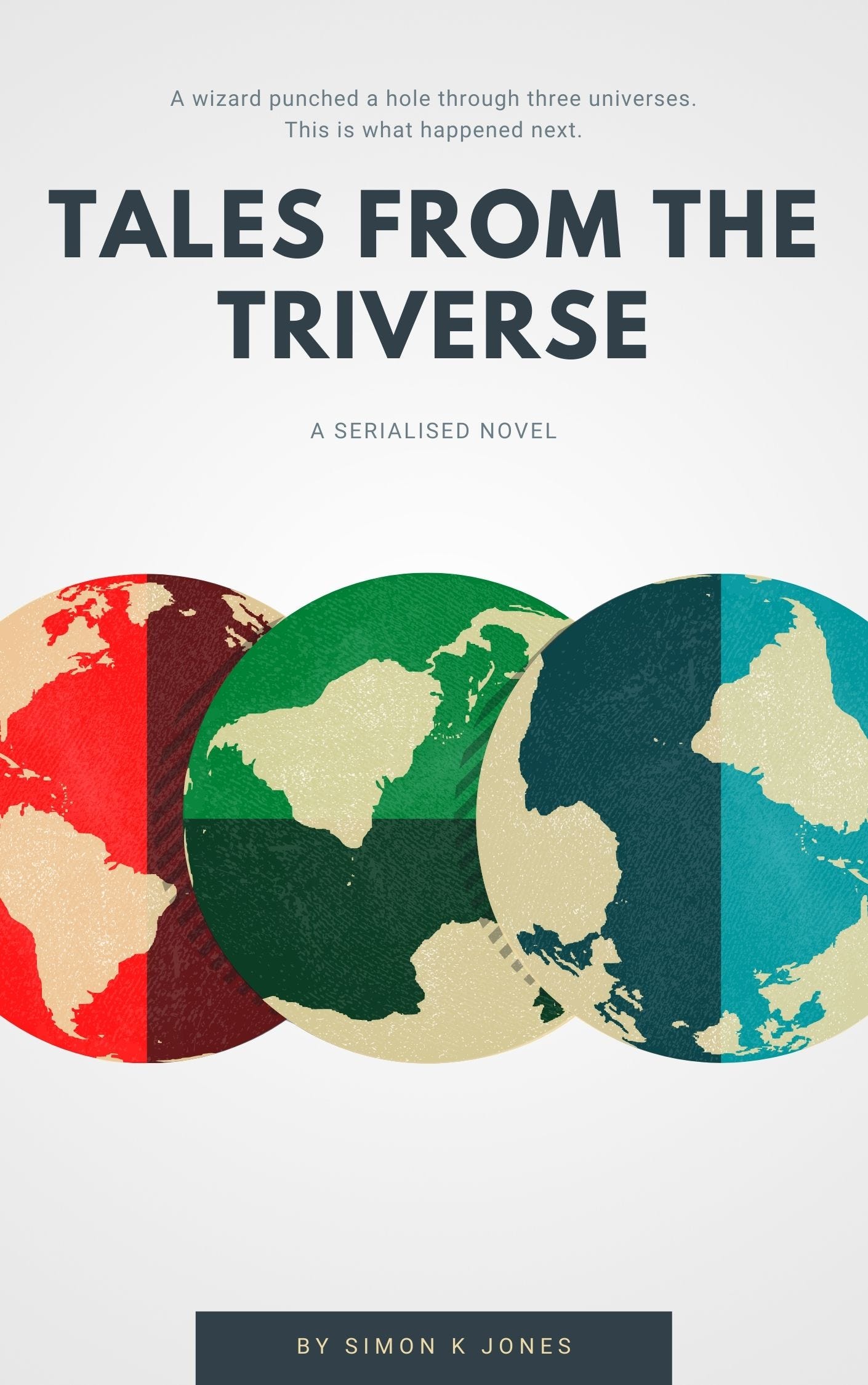
I wanted to reflect the three-universe nature of the plot in a visual way, so settled on the triple Earths fairly early. For this particular cover I took a few shortcuts, namely: I used Canva. This isn’t something I’ve done before with my covers, but I knew that I wanted Triverse to have a clean, almost scientific feel, and Canva is a good tool for regimented, clean designs.
The off-white background and creamy colours makes me think of 1970s science fiction films, like The Andromeda Strain, but without becoming too kitsch or overtly retro.
The tagline up the top is playful and a little silly, contrasting with the seriousness of the design. It’s a wink at the potential reader that what’s inside might not be exactly what they expect.
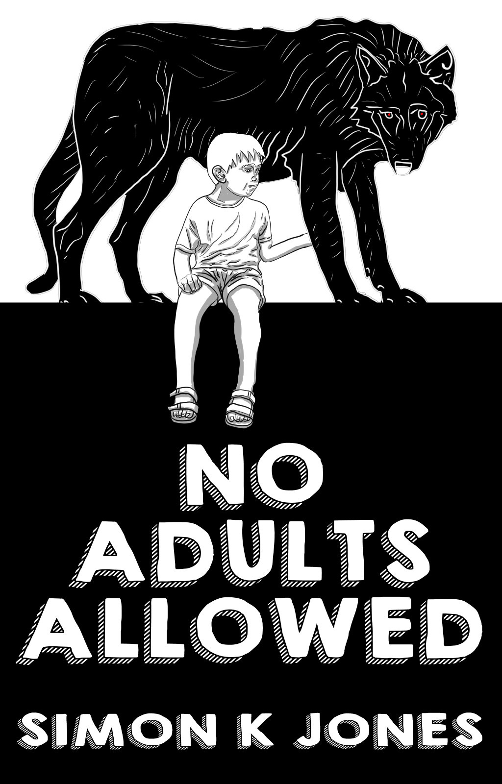
No Adults Allowed
My third book was written during 2020 during the height of the pandemic. It’s a post-apocalyptic adventure laced with optimism and is about how young people are the planet’s last, best hope.
Here’s the cover:
This cover went through a lot of iterations, as you can see here:

To dig into those a bit, the first one I thought was really clever when I first put it together:

The story is about a bunch of kids who have to save the world (sort of), and there are no adults in it at all. Basing it on the sort of notice kids hang on their bedroom door I thought was really fun. There were two problems:
The stock image I used for the door was way off, being far too fancy.
The idea of a bedroom door doesn’t fit with the setting of the book, so can throw readers off right from the start.
It was as good example of a half-good idea. Took me far too long to realise this, though.
When I redesigned the cover I went through a few layouts before settling on the 2/3 black and white split, with the boy sitting on a wall. My initial concept was way too fussy and gaudy, due to me trying to fit too much into it, before I then pulled back and went for the simpler black and white stencil style.
The Mechanical Crown
This one is full-on epic fantasy adventure, and I needed a cover to reflect that. I’d stumbled upon the work of a fellow Wattpad user weeknder and asked her if she’d be interested in working on something. She fortunately said ‘yes’ and that’s how I got this:
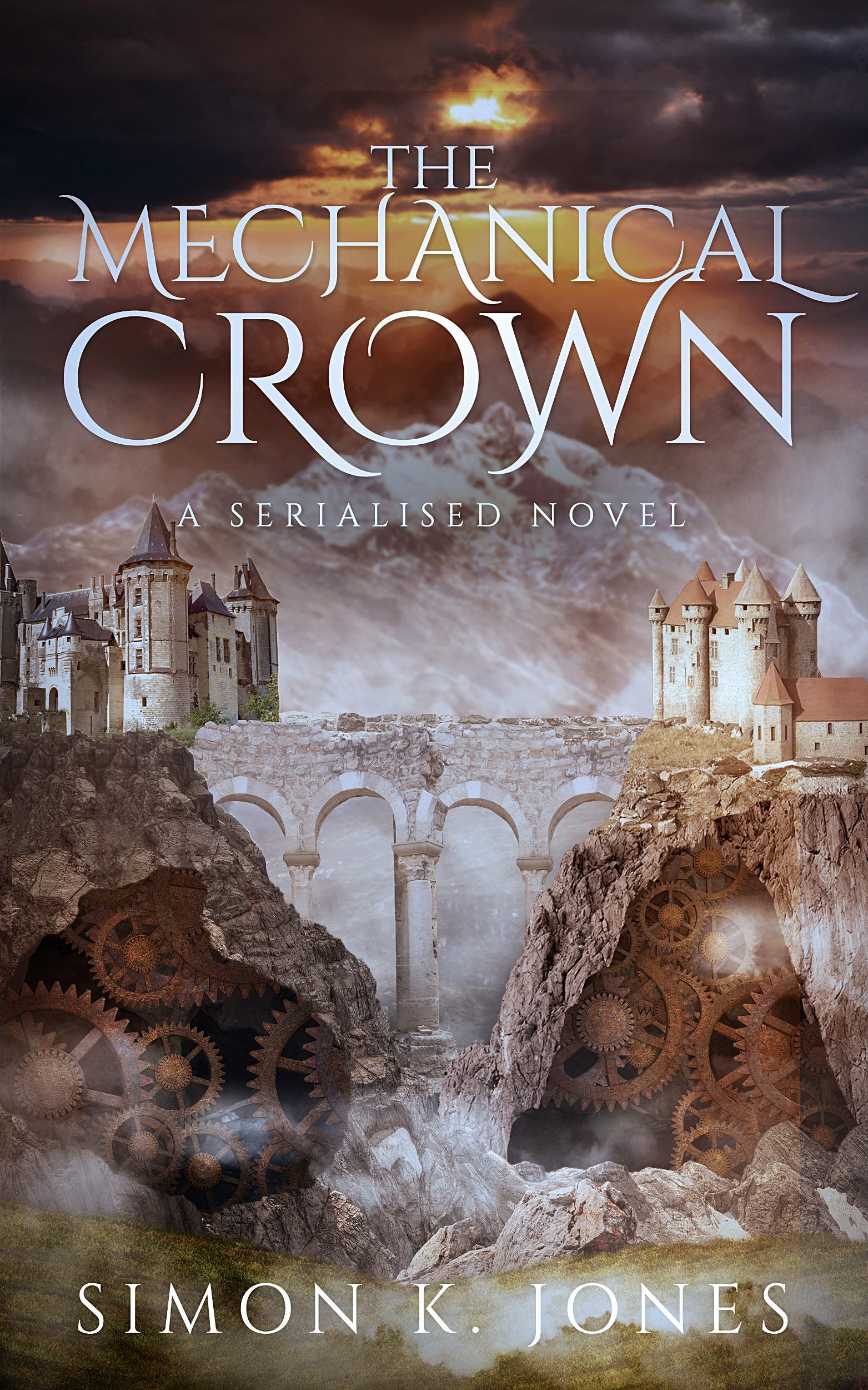
Lovely. At full size you can see some of the edges in the comp, but used as a thumbnail on Wattpad it worked PERFECTLY. It accurately reflects the themes and tone of the book.
The process for this one was interesting. I’d actually started off with a DIY job:

You can see the general design idea at work there ( a beautiful city with unknown machinations beneath the surface), but it’s clearly just a stock image of the astonishing Mont Saint Michel in France with a threshold filter applied:

Just look at that place.
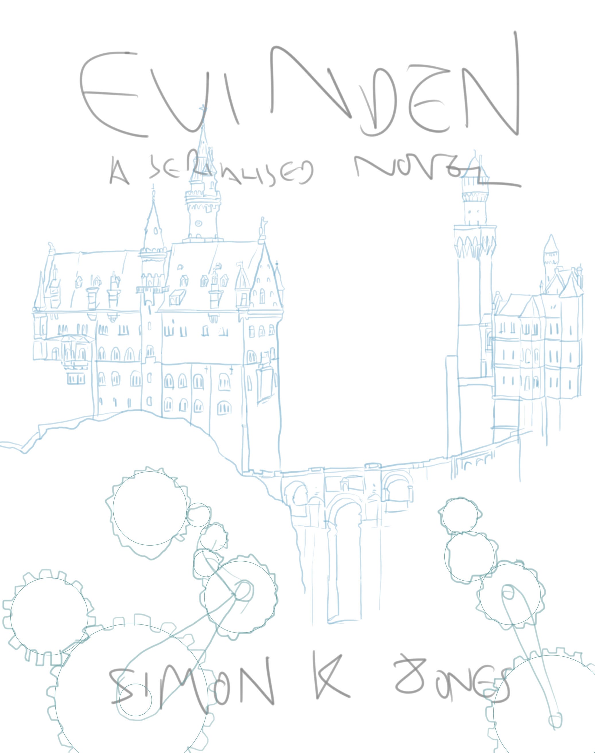
I sketched out a design mock-up to help explain what I was really after:
Weeknder went through a few versions before we got to the final. Here’s one of the earlier drafts:

Working with a freelancer was a great experience. I highly recommend it.
A Day of Faces
My first serial went through numerous design changes, the cover shifting over the course of the story. Here are all four of the ‘arc’ covers:
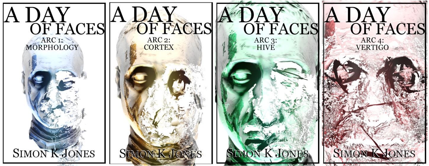
The idea being that the head shatters and becomes larger with each one, as the story intensifies. It’s a story about identity, so the anonymous face disintegrating seemed to fit. In retrospect it would have been better to have it be representative of the narrator, but that was beyond my design capabilities at the time. I might return to it at some point for a future ebook release.
This one went through various redesigns over the course of the book. Here’s an earlier iteration:

The cover was based off a free 3D model, which was a useful technique in that it enabled me to iterate and play around with angles and layout quickly.
That’s the covers for my four books. I’d love to see yours! Please do share links to your cover designs down in the comments.
I really need to work on this. I was lucky with Playtime's Over that Propolis' in-house designer gave me a perfect cover, utterly brilliant. As a hybrid author, though, my self-published covers have been, to date, fairly woeful.