Something of a nuts-and-bolts newsletter today. I’m still in the tail end of recovering from having covid last week, with my brain feeling like it’s only operating at half speed. Hopefully what follows a) makes sense and b) is useful.
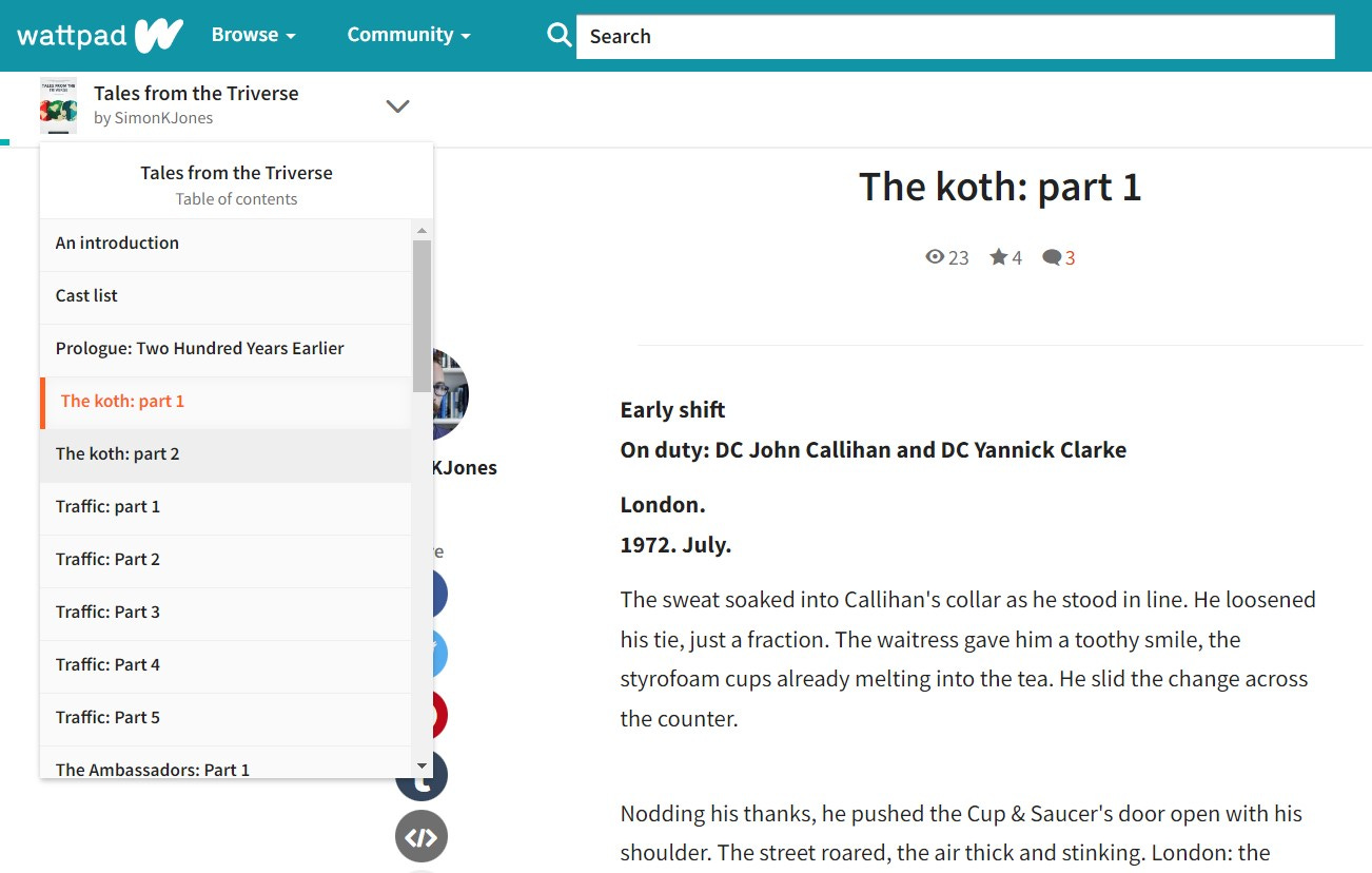
I published for many years more-or-less exclusively on Wattpad, which is a platform specifically designed for writing and reading serialised fiction. This has a number of built-in benefits. Here’s the reading view on desktop, where you can see a useful index menu that makes it easy to jump to any chapter in the book:
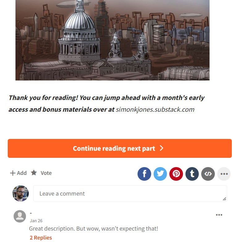
Readers are also guided when they reach the end of a chapter, immediately able to jump into the next chapter without any faffing about:
Substack, being a much more general newsletter platform, does not currently have this kind of functionality built-in. After all, a Substack newsletter can be all sorts of things, not all of them requiring sequential linking of multiple parts.
It is possible to replicate a similar approach, which for writers of serialised fiction (or non-fiction) is vital if you want to avoid frustrating your readers. I’m still working out much of this, but I thought I’d run through my standard chapter layout in case it’s of use.
Borrowing from TV
The overall design of my posts is influenced significantly by episodic television. They’ve been doing this for decades, even while literature largely moved away from serialisation, and whether it’s traditional broadcast or streaming shows the formula is often similar.
Here’s what the top of one of my chapters tends to look like:
Let’s break it down:
When I first started publishing chapters on Substack, I’d have a friendly intro blurb from me talking about my week, any news and so on. I keep all this to the bottom of chapters now, as it got in the way of readers simpy enjoying the new chapter. Any kind of intro is especially irritating for anyone who is reading multijple chapters in a row, such as someone who has discovered the story halfway through its run and is catching up. Those intros also date quickly, which isn’t really a big deal at the bottom but could be confusing or distracting up top.
The ‘Previously’ section is a short primer to remind readers of what’s come before, and give any new arrivals some kind of context. Same as the ‘previously on’ bit at the start of television episodes.
We then have two very important custom buttons. I always add two, giving readers quick links to either jump to the very beginning of the book, or to hop back a chapter. This is something that has to be done manually on Substack, as there’s no built-in way to navigate between sequential chapters.
After the buttons there’s the splash banner, which reinforces the name of the book and makes it clear that we’re about to dive into the meat of the story.
After the banner, the chapter begins.
Every chapter opens like this, and it gives readers a familiar structure so that they know what to expect.
Custom buttons can be added from the ‘Buttons’ menu at the top of the Substack editor. You simply enter your link copy and the destination URL.
Extra touches
My chapters often have scene breaks. In Scrivener I mark these with a simple asterisk. When I upload a chapter to Substack for sending out as a newsletter, I replace those asterisks with a funky little custom icon that looks like this:
Using the front cover motif as a scene break icon helps to give the book a more professional feel and lets readers know that I’m putting in some effort. It’s very little effort on my part, but helps to raise the presentation of the chapters quite considerably.
At the end of the chapter I’ll sometimes include an illustration, and will often add a button to encourage people to leave a comment. An important element can only be added a week later, which is a ‘Next chapter’ button. Each time I add a chapter, I jump back to the previous one in order to link them together and make it easy for readers to keep progressing. Again, it’s a feature we have to do manually for the moment.
Using sections
Substack have a feature called ‘sections’, which is a way of grouping particular content under a group heading. A section can even exist as a separate newsletter, with readers able to adjust their subscription preferences per-section. For example, you can choose to receive my writing tips (like this newsletter) and my fiction, or only pick one.
In this manner I’ve grouped Tales from the Triverse into a section, as well as my Writing Serialised Fiction guide. Readers can easily jump into those sections to filter the viewed content. It’s important to remember to pin the first chapter of a sequential series, so that it’s easily discoverable at the top of the section.
I actually created a custom landing page for new readers, which is pinned to the section and to the main home page of my newsletter. It serves as an introduction to the book, explains how everything works, and gives new readers are simple way in. You can take a look at it here:
Different approaches to the paywall
Over the course of publishing Tales from the Triverse I’ve experimented with several different forms of payment.
My original plan was to publish the first half dozen chapters for all to read as a limited preview, then paywall the rest. That would have meant that only paid subscribers would be able to continue reading the story. This rapidly became unappealing: it means that all my new chapters would effectively be hidden, making promotion difficult, and the nature of the story is such that it is quite a slow burn. I also was uncomfortable with expecting people to pay to read my work, and I didn’t want anyone locked out of the story simply because they couldn’t afford it. That would suck.
I then shifted to an early access model. This was made considerably easier by Substack implementing an early access feature, whereby a post can start off for paid subscribers and then at a specified date be unlocked and sent out to everyone else. The early access model meant that paid subscribers had access to chapters five weeks ahead of free subscribers. It was neat and elegant, but it still meant that promotion was a bit fiddly and oddly delayed. From a financial perspective, I was also never quite convinced that my writing style suited early access. Also, people could quite happily just read with a five week lag, but still get a new chapter each week.
More recently I changed to the current setup, which focuses on bonus content. In this model all of the fiction is free for everyone to read, and everyone is at the same point in the story. The paid aspect is in the form of behind-the-scenes author notes, which are only accessible to paid subscribers. This feels like a good fit, in that the fiction is fully accessible, while fans and those able to financially support the book get to have some extra access to how the book is being put together. The way Substack works, it also means that the Friday fiction newsletter can go out to everyone, while having a paywall at a specific point below the main chapter. Everyone gets to read, and free subscribers get a useful reminder every week that there’s a paid option. It feels open and generous and I’m quite happy with it so far.
Perhaps the main tip is to not be too inflexibile; changing and adapting has been a big part of my writing on Substack so far, and I imagine it will continue to be so.
That’s how I’m using Substack for fiction. If you’re doing it differently (or better!) please do let me know, as it’s still early days for all of us writing here.
In other news, there are a bunch of great ebook giveaways happening at the moment. Check out the links, where you’ll find lots of freebies (including my Tales from the Triverse collected edition):
June Sci-Fi Giveaway does what you might expect, with lots of fun science fiction indies to explore.
Imagination Unleashed is a big ol’ mix of science fiction and fantasy.
Father’s Day Giveaway is where you can download a new dad. I think? Something like that.
Great tips! Thanks got sharing
I've seen serials that have a next chapter previous chapter link at the top of the page here on substack. I can imagine how annoying it can be to do it manually but it really does help the reader experience and seems worth the extra set up time
Another insightful and practical article thank you Simon! With the BTS work you do behind the paywall, it’s obviously extra time and effort on top of the writing. I often wonder what readers would want to see and be willing to pay for. I figured that paid subscribers would be more willing to pay for news/non fiction. Has fiction been popular for paid subs? At this stage I’ve not found a writer I would pay regularly for, compared to the us$10 I can pay for KU. Thanks